
The best graphic design websites to inspire you to create your online portfolio
Are you a graphic designer looking for inspiration to create your own online portfolio? Then check out this curated list of the best graphic design websites that are sure to inspire you to build your own. In this post, we also included a short list of websites where you can find more graphic design portfolio ideas and a few guidelines to help you create your own striking online portfolio.
So here they are - the most acclaimed and awarded graphic design websites and portfolios across the internet, featuring professionals from all over the world and brought to you in alphabetical order.
1. Active Theory

With offices in Los Angeles (California) and Amsterdam (Netherlands), Active Theory is a creative digital production studio who “make bold things for the big guys”. And with a statement like that, their portfolio needs to live up to their reputation!
Animation is the keyword here. As one of the best design websites, Active Theory provides an immersive 3D experience. As you land on their homepage, you quite literally enter a new world, and for a few seconds you just won't be able to take your eyes off it! Creative Bloq calls the aesthetic “Blade Runner-ish and moody”, and if you head over to the website and take a look, you’ll see why.
Active Theory uses one clear call to action, and that’s an invitation for the user to go and check out their work. Arguably, you don’t even need to though, as they tell you everything you want to know about them on their home page, thanks to the mesmerising animated experience and website graphics.
But when it comes to displaying their portfolio, Active Theory choose a clean look for their projects. Examples of their work are featured through a full-screen animation, overlaid with information and links about each project. Truly fantastic.
2. Alex Coven
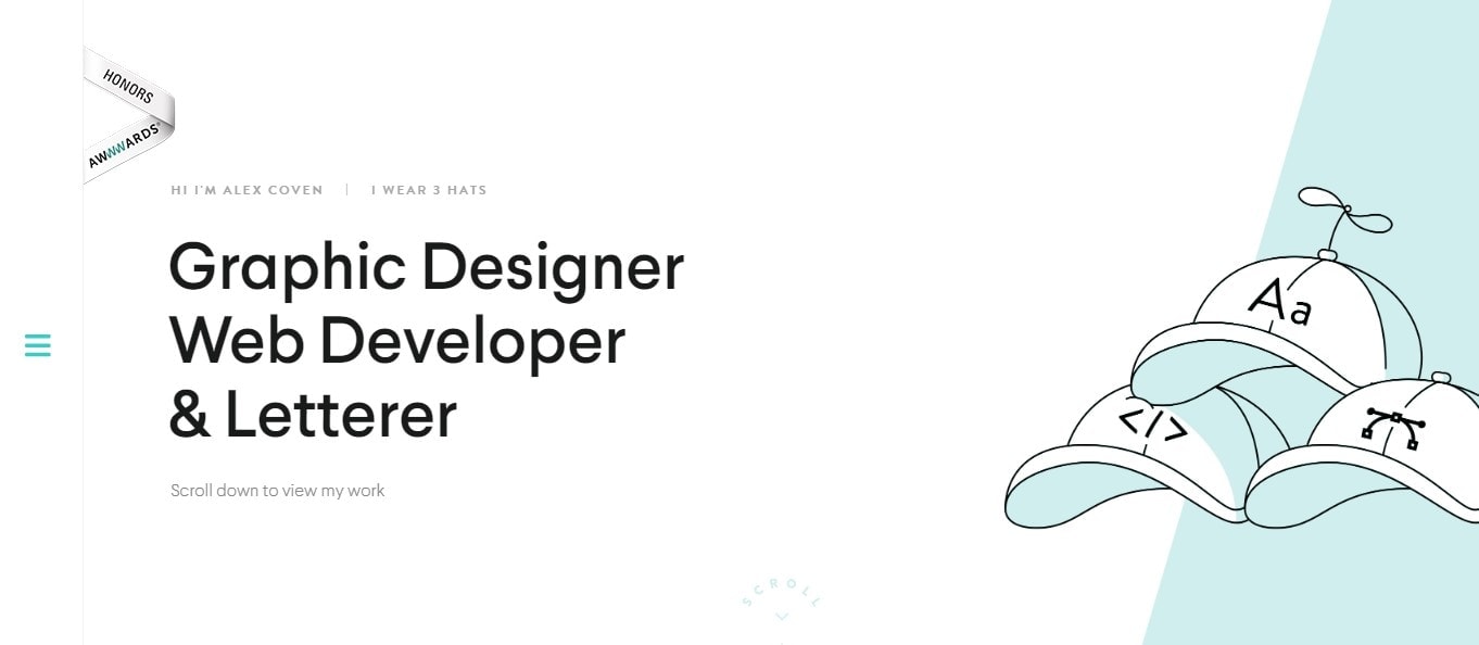
As he puts it on the home page of his website, Chicago-based Alex Coven wears three hats – he’s a Graphic Designer, a Web Developer, and a Letterer. Straight from the word go, Coven tells you exactly what he does. His website is all about clarity and simplicity.
His design is simple yet effective – just scroll down, and you'll see his work. Coven overlays each project with a different colour, which makes the website both user-friendly and impactful.
You may also notice how he uses the full-width of the screen, making the website all about his work, with no distractions around it. And if you want to find out more about each project, a handy arrow on the right-hand side of each section points you into the right direction. It will show you how to improve your own web design process.
3. Buzzworthy Studio
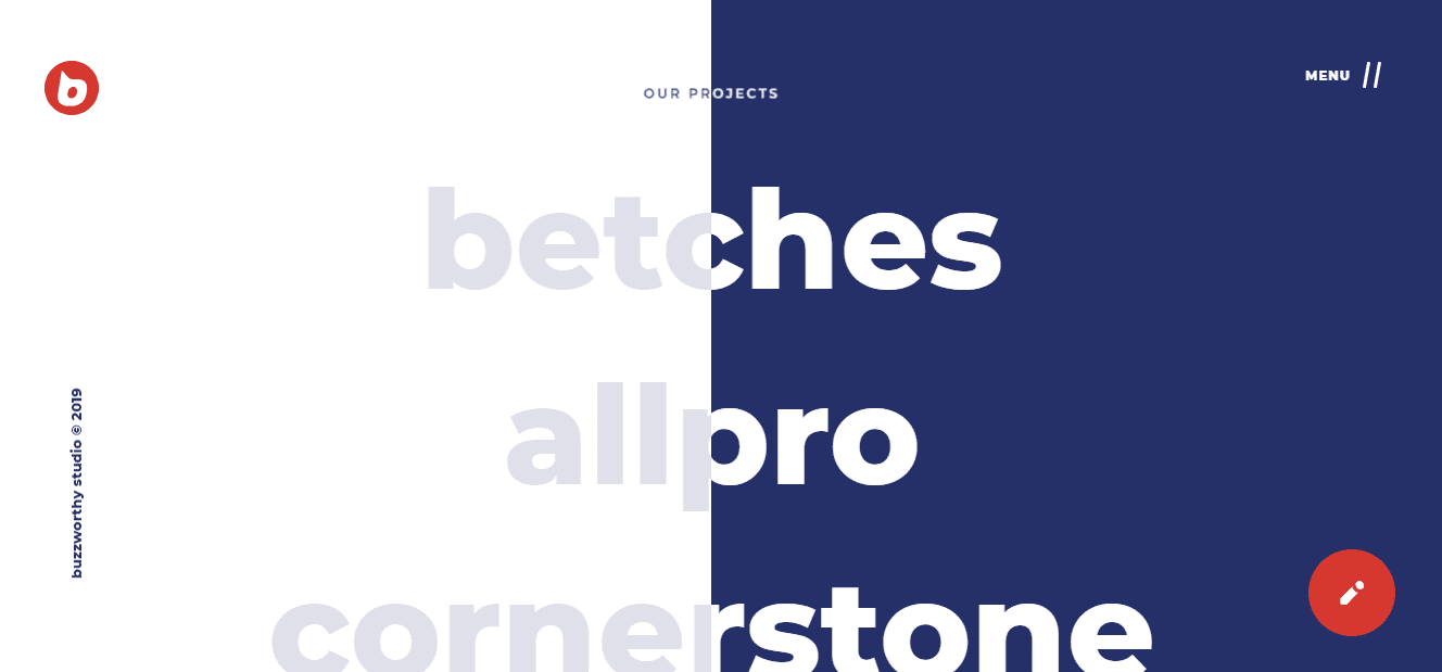
Based in Brooklyn (New York), design agency Buzzworthy Studio’s website helps them stand out from the crowd. As you land on their website, you’re greeted with the message “We create extraordinary digital solutions that get people thinking” – it’s bold, and it’s out there.
But blink and you’ll miss it. Because the Buzzworthy Studio's website uses animation and interactive features that make for an attention-grabbing and interesting experience. Their bold message disappears after a couple of seconds to introduce us to their home page.
They also make great use of headers and full-width images that give you plenty of details on each of their amazing projects once you hover over and click through. If you’re looking for inspiration as a web designer, this is definitely one to check out.
4. Femme Fatale Studio
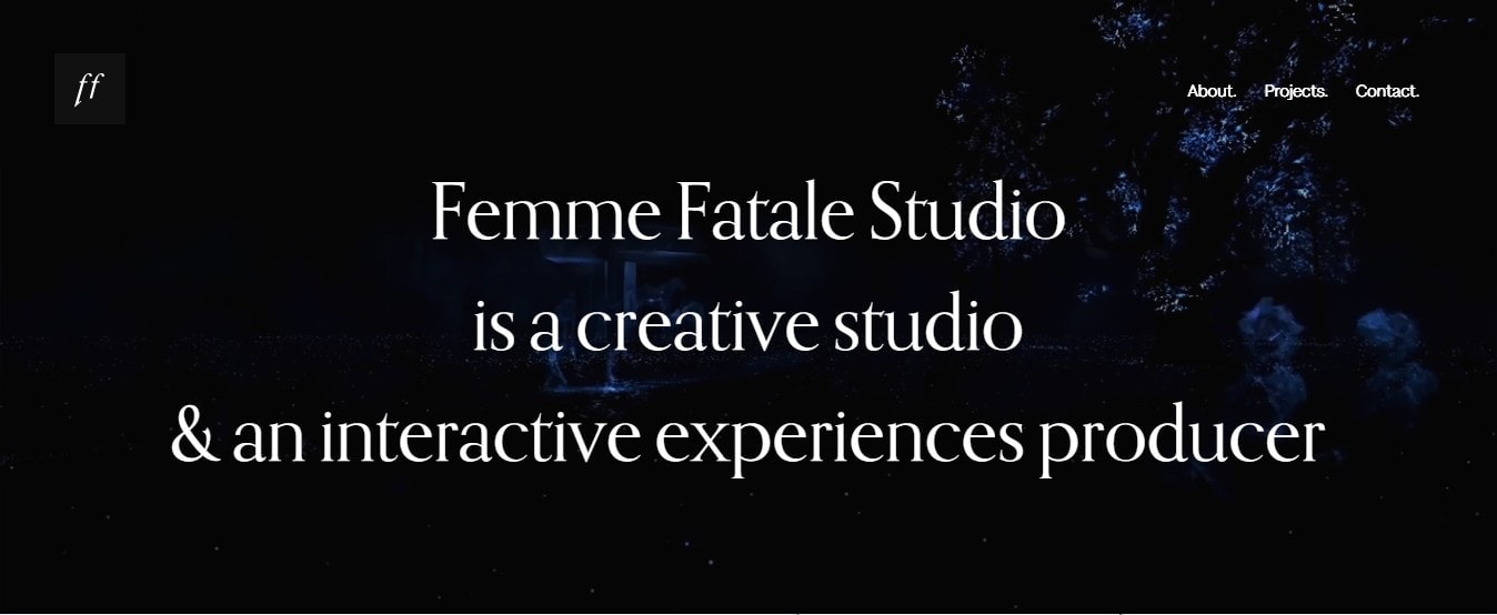
The clue is in the name here. Paris-based Femme Fatale is a creative studio that specialises in interactive experiences and animation. And as soon as you land on their website, you can tell it’s the work of famous graphic designers. On their home page, they display a series of images and animations that give you a clear idea of what their work is all about.
They also make use of bold images and special effects, including parallax scrolling, a technique where background images move past the camera more slowly than foreground images. This creates an illusion of depth and a sense of immersion. Check it out!
5. Locomotive
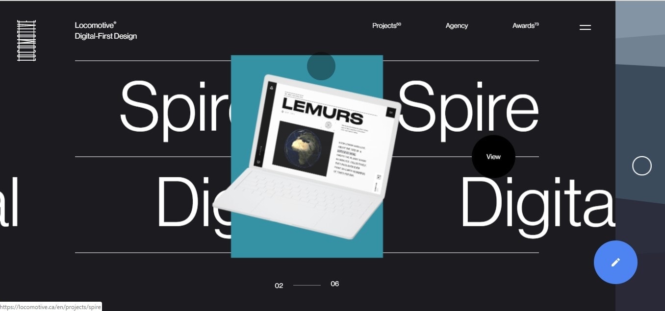
Canadian (Quebec-based) studio Locomotive also makes use of movement and interactive features on their home page. Their playful and colourful animations are used against an elegant and timeless black backdrop, and they say a lot about their work.
When you click on the Projects page, you’re greeted with the message: “Locomotive develops, designs and delivers websites and creative campaigns that drive results, build awareness and win awards. Our work never brags, but it sure loves to speak for itself.”
And they certainly do that very well without compromising search engine optimization.
Back on the home page, an intriguing and attractive blue button on the right-hand side featuring a pencil icon will soon get your attention. And you certainly won’t be disappointed once you click on it - you'll want to check out their humorous copy and use of the voice feature!
6. Pollen
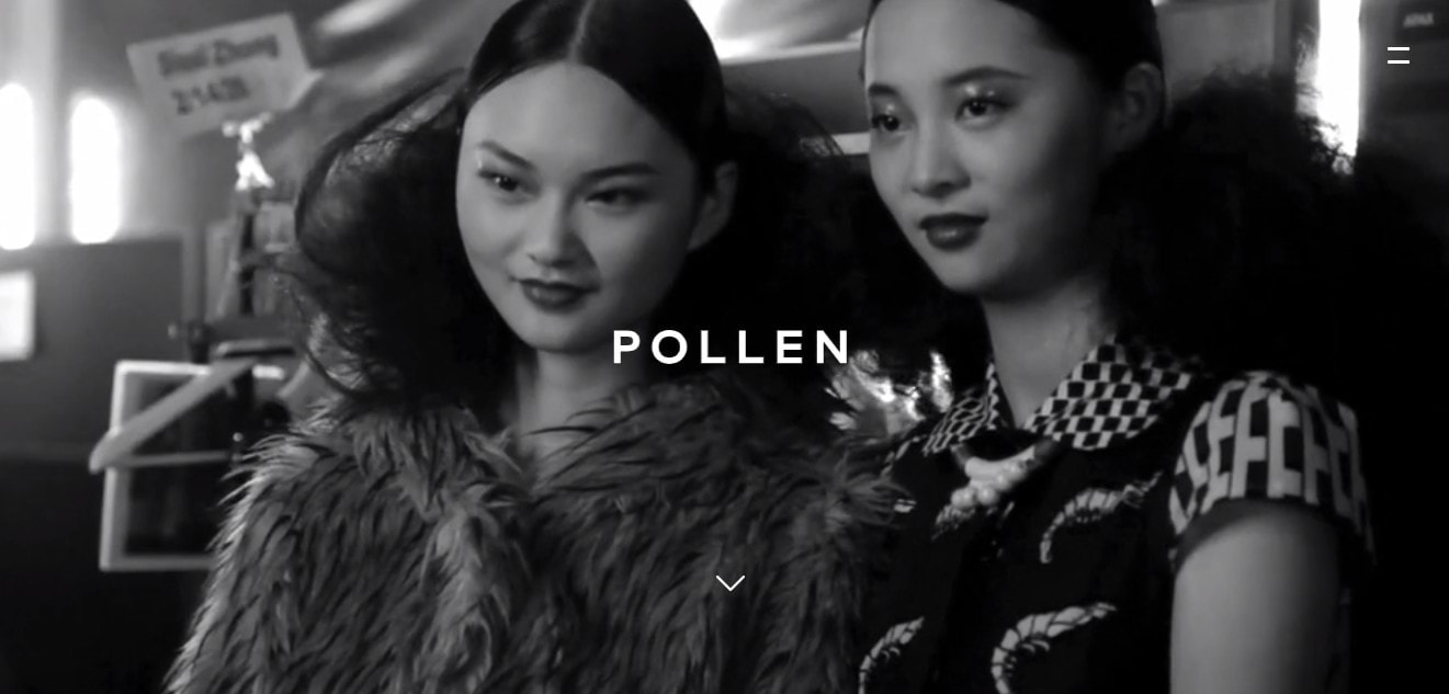
London-based Pollen is an award-winning, full-service branding and digital agency that specialises in the fashion and retail sectors. And you'll know that the minute you land on their website, where you’re greeted by a series of black and white animated images. Visually, the photos set the tone and scene on the home page area above the fold and also introduce the user to an engaging presentation of their online graphic design services.
Like other designers, Pollen makes use of the full width of the screen, leaving no room for distraction. Scroll down on the page, where their portfolio is displayed, and you’ll see that parallax scrolling becomes one of the most prominent features on their website.
Not to mention how effective their unique choice of sprinkling their own quotes and mission statements across the page is! Things like, “We understand that design is a business investment and always deliver significant and measurable results for our clients" help you get a real sense of what's important to them and what they're all about. Great move.
7. Stefanie Brückler
New York-based Stefanie Brückler is an Austrian graphic designer and illustrator specialising in branding and editorial design. Scroll down on her home page (after admiring her logo for a second or two), and you’ll be presented with a selection of her work, displayed elegantly through a grid-based layout. Her website is elegant and minimalistic.
And it stands out because of Brückler's choice to use a muted colour palette. Muted colours are definitely not the norm - you'll have noticed most designers included in this list use impactful, bold colours instead.
But Brückler's colour palette plays a key role in giving the whole website a cohesive and consistent look. This isn't always easy to achieve, especially if you consider that most designers face the challenge of displaying work from different brands, each with their own distinctive look and feel. The fact that Brückler manages to achieve this consistency so effortlessly is a great testament to her skills. If you’re selling art online, perhaps you could borrow inspiration from Stefanie.
8. Tobias van Schneider
Tobias van Schneider, is an award-winning designer born in Germany, raised in Austria and currently living in New York. (Although his home page suggests he previously lived in Stockholm!). He specialises in digital product design and brand identity, and his portfolio includes some of the biggest names out there, including Spotify and Sony, just to name a couple.
What makes his website stand out (aside from the list of brands he’s worked with) is the imagery - and in particular, the photographs he uses. The above-the-fold section of his home page uses a striking black background with huge fonts. Scroll down, and each project is displayed against a different background colour, but the layout and the unique choice of typography ensure the page is consistent and always on-brand.
9. ToyFight
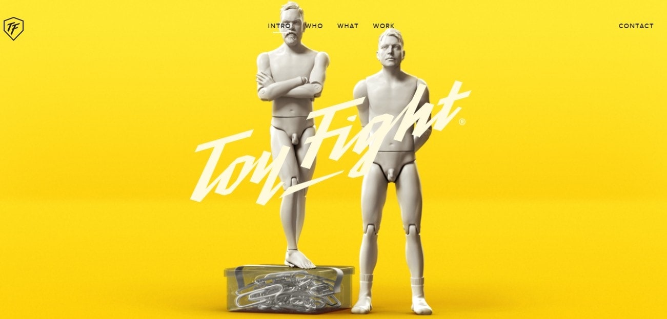
Manchester- (UK) based studio ToyFight will wow you with their 3D animated images of the founders, which are used consistently across their website. On the home page, you can’t miss the distinctive bright yellow background, but the use of solid bright colours as a backdrop is a consistent feature across the whole website.
ToyFight are “an award-winning creative agency specialising in design” who “partner with global brands and emerging businesses to create exciting and meaningful experiences, whether digital or non-digital”. And if their website is anything to go by, you can tell they know how to create something memorable. Just need to head over their Work page and see how they’ve chosen to list their projects.
10. Qode Interactive
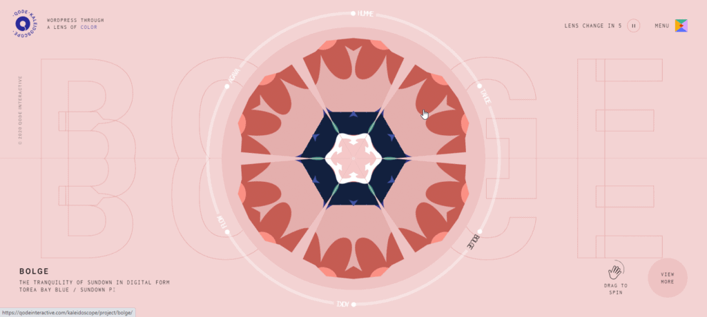
And last but not least, the Qode interactive Kaleidoscope has a very unique portfolio making heavy use of animation.
Qode Kaleidoscope is a collection of WordPress themes with distinct color-driven visual identities.